Sunday, February 24, 2019

Scrollwork - Distress Ink and Watermark Resist

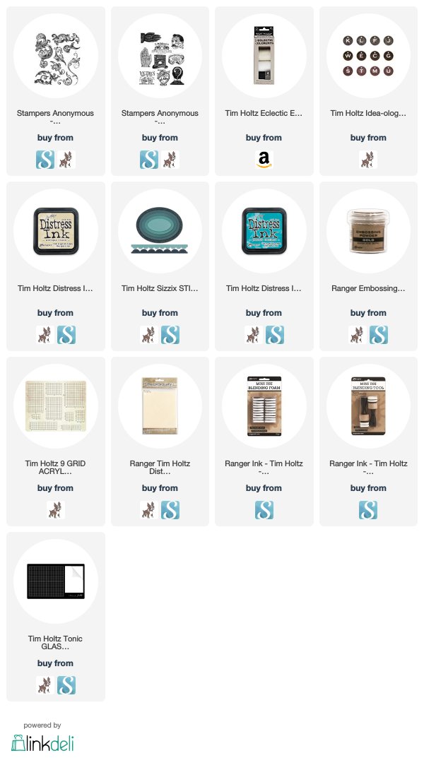
This is a card I made for a friend using the new Scrollwork CMS367 and Eclectic Adverts CMS372 stamps from Tim Holtz and Stampers Anonymous.
To make the background I started by putting a piece of Sticky Grid onto my Stamp Platform because I wanted the scrolls to cover the entire surface and didn't want the magnets in the way.
 Then I put the piece of Distress Mixed Media Heavystock onto the Sticky Grid.
 I arranged the scrolls from the Scrollwork stamp set.
 Then stamped it with the almost clear Watermark Resist Ink.  The darker one seen below was stamped with Hickory Smoke Distress Archival just to see what would happen.
 These pictures were taken as I was experimenting with this technique to see if Distress Spray Stain would work with this technique as well as the Distress Ink Pads on the nonstick mat.
 After I sprayed the Distress Stains onto the paper, I spritzed them with a lot of water to give it a soft feeling.
 I also used a towel to soak up any of the really dark spots. In the photo above you can see how differently the Archival Ink and the Watermark Resist react differently with the Distress Stains.
 Then I dried the ink. I didn't do the water spots on this as I wanted the colors to blend together lightly and smoothly.
And here it is. You can see how there is a little resist that gives it a distressed look, but the ink also soaks in the color.  It's really cool! I love it.


 Sorry it is sideways...I can only edit and upload video on my phone and I couldn't figure out how to rotate it. 

Here is a quick little video showing how I made this type of background for the card below. I applied Distress Ink to the nonstick mat on my glass mat and sprayed it with water and then pressed the stamped paper into the ink. I did this several times until I got the saturation I was looking for. 
I believe for this card I used the colors Brushed Corduroy, Chipped Sapphire, and Vintage Photo.
I cut a small tag from the Stacked Tags die set and then stamped the hand advert onto it from the Eclectic Adverts stamp set, in Black Soot Distress Archival Ink. The I colored the tag with a little Chipped Sapphire and Brushed Corduroy.  To make it stand out on the card, I sprayed it with a layer of Distress Resist Spray. I tied a piece of jute through the tag and popped it up with dimensional adhesive.
I made another card for a another friend using the same technique but with a different stamp -- the Glorious Garden stamp.  It ended up being very soft and subtle compared to the scrolls.
I also experimented with this stamp the other day using the Watermark Resist Inks with the Distress Spray Stains and Spray Oxides.  The result was a very different look than the one above, but it's always fun to try new things with techniques.
I hope this inspires you to just play around with your stamps and inks and see what happens! As always I appreciate you taking the time to stop by.
Tami

I am an affiliate with Simon Says Stamp and Scrapbook.com so the links below send you to one of those stores depending on which logo you choose.  If you wish to purchase something from either store and use one of my links below, I get a small percentage of your order, at no additional cost to you. This helps me to defray the costs of this blog and the ideas and tutorials I post here, and your help is greatly appreciated! Thank you!
Friday, February 22, 2019

Life in the Footlights - Tim Holtz Ideaology

 Life in the Footlights is a piece dedicated to theater life on Broadway.  I used existing pieces and new pieces of Ideaology from Tim Holtz. When looking at it straight on, it is supposed to look like the proscenium of an old theater stage, lighting up at the bottom, just as footlights would illuminate a stage from below, and with pulley wheels at the top peeking from under the top of the proscenium  archway to represent the fly system.
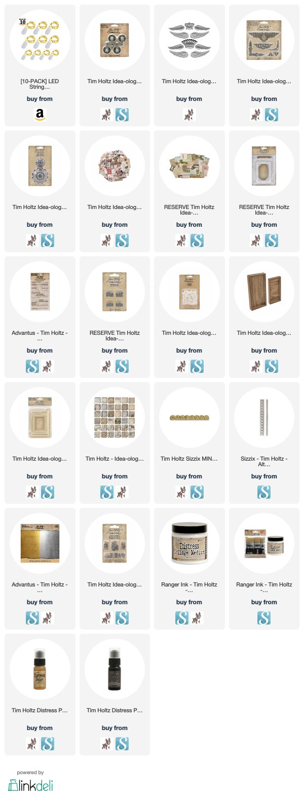
 Here is a closer look at the top of the archway or Proscenium. You can see the pulley wheels and rope representing the fly system that allows the stage hands to change scenery quickly. The Vignette Accent corners, Regal Adornment crown, and Sizzix 3-D Scallop were to give the stage the feel of gilded opulence.
 The sides of the proscenium archway are adorned with the smallest of the 3-D Star Border Impresslits that will be released later this year from Tim Holtz and Sizzix. The die/embossing folder combo is just like the 3-D Scallop, it cuts and 3-D embosses at the same time.  I really love this star border set!
This is another view of the pulley wheels. It also allows you to see the gilded finish. The whole vignette tray, the chipboard pieces across the top and bottom, and the Vignette Frame are all covered in Tarnished Brass Distress Paint and then wiped with Black Soot Distress Paint to give it an old, gilded theater feeling. The back and inside walls of the tray are covered in a charcoal stripe paper from the Ideaology French Industrial Paper Stash.
My inspiration for this piece consisted of this postcard of Broadway, and the delightful NEW Photo Booth photo of this lovely lady. I decided she looked like an actress and so I paired her with the postcard and then the story for the rest of the piece started to fall into place. The postcard is from the NEW Layer Remnants. Several pieces of Layer Remnants were used on this piece, as were some pieces from Ephemera Snippets.
I layered the Vignette Frame onto a large NEW Lace Baseboard Frame.
 The small bouquet and theater ticket are from the Ephemera Snippets. The flowers represented some that would be given to a cast member after a performance, and of course a theater ticket is needed to even gain admission to the show.  These sit on a Layer Remnant that is an advertisement for a photography studio, where I'm sure many actors needed to get headshots and PR photos.
I added a few more Ephemera layers at the bottom with some Clippings Stickers to fit with what I thought would be part of a broadway actor's life, like a calendar of performances, auditions and so on. A cast of characters for the play Our House sits on top of a piece of ephemera with a bunch of names.

I cut some chipboard in two sizes and painted it to match the rest of the piece before I added the Typography letters. Some small Hardware Heads adorn the corners.
I finished the bottom with two more corners and floral piece from the Vignette Accents. In order to have enough of the corners for this project you will need two packages of the Vignette Accents.
The base is the largest Vignette Base painted with Tarnished Brass Distress Paint and and wiping a little Black Soot Distress Paint over it.

I hope you enjoyed tonight's performance and invite you to return again for an encore.
Tami

I am an affiliate with Simon Says Stamp and Scrapbook.com so the links below send you to one of those stores depending on which logo you choose.  If you wish to purchase something from either store and use one of my links below, I get a small percentage of your order, at no additional cost to you. This helps me to defray the costs of this blog and the ideas and tutorials I post here, and your help is greatly appreciated! Thank you!

Thursday, February 21, 2019

Spectacles - Scrollwork CMS367

One of the new stamp sets from Tim Holtz and Stampers Anonymous that is available this month is Scrollwork CMS367. It is a full set of various scroll shapes that can be used individually or as seen on this card, I stamped most of the scrolls so they made a vintage looking background.
To make the background, I colored a piece of Distress Multi Media Heavystock with Antique Linen Distress Ink. Then I stamped the various scrolls onto it with Distress Embossing Ink and embossed it with Superfine Gold Embossing Powder. Then I watercolored inside the scrolls with Distress Ink Peacock Feathers. 
I cut the center out with two different sizes of the Stitched Ovals dies. Then in Black Soot Distress Ink, I stamped the spectacles image from the Eclectic Adverts CMS372 which is released in March 2019. I watercolored just the word spectacles.
As I stated in my last post, I like having even the tiniest bit of a story with my projects.  With this one it is the Muse Token with the E for Excellence with the "Spectacles the Best in Use." I picked the E because it is the top letter on the eye charts you have to read when getting fitted for spectacles. The excellence on the token goes with the fact that the LM Moses spectacles claim to be the BEST in USE.

I hope you liked what you "saw" on the blog today! Thanks for taking a "peek!"
Tami

I am an affiliate with Simon Says Stamp and Scrapbook.com so the links below send you to one of those stores depending on which logo you choose.  If you wish to purchase something from either store and use one of my links below, I get a small percentage of your order, at no additional cost to you. This helps me to defray the costs of this blog and the ideas and tutorials I post here, and your help is greatly appreciated! Thank you!


Wednesday, February 20, 2019

hi! - Tim Holtz Sizzix Chapter 1 2019

This little card packs a giant primordial greeting! The technique for making it is one that can be used for many other mediums besides just cards.
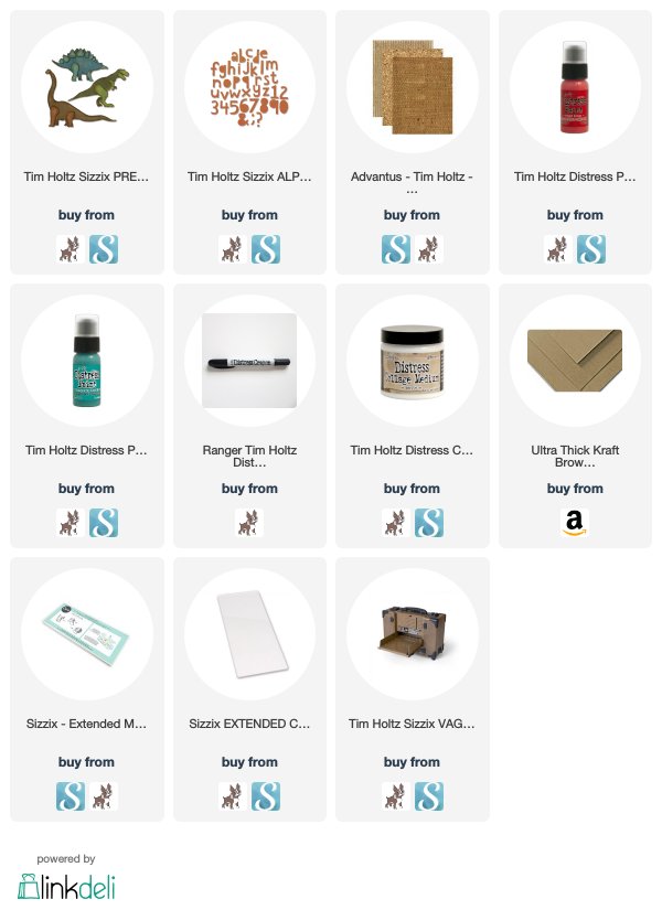
The Prehistoric dies from Tim Holtz and Sizzix, were what I used to make this card. These dies can be cut with the additional layers that are placed on top of the base shape. But on this card I only used the base shapes.
I cut the focal point and the sentiment out of thing green vinyl like I did on the Party Like a Dinosaur card. I used the Cut Out Alphanumeric Lowercase to cut the sentiment "hi!" out of the dinosaur. Then I wiped over the green vinyl with Fired Brick Distress Paint and then with Black Soot Distress Paint. Lastly, I sanded it to allow the green to show through in spots.
For the background, I did the same technique that I have used on several Etcetera Tags including the one here. The tag base is kraft colored so to use the technique on the card, I chose a kraft colored card base, then I cut out the dinosaur shapes from the same Kraft paper, I adhered them with Distress Collage Medium Matte, then covered the whole base with Evergreen Bough Distress Paint. When it was dry I sanded it , covered it with another coat of Collage Medium and then rubbed some Black Soot Distress Crayon to help the edges of the dinosaurs to stand out.

I finished it off with a piece of Corrugated paper, and some Eclectic Elements Craft Thread.

Thanks you for visiting!
Tami

I am an affiliate with Simon Says Stamp and Scrapbook.com so the links below send you to one of those stores depending on which logo you choose.  If you wish to purchase something from either store and use one of my links below, I get a small percentage of your order, at no additional cost to you. This helps me to defray the costs of this blog and the ideas and tutorials I post here, and your help is greatly appreciated! Thank you!


Monday, February 18, 2019

Dreamer of Dreams - Tim Holtz Ideaology

 Dreamer of Dreams is a project I made for the Ideaology Booth at Creativation 2018 last year.  I just never got around to posting about it.

I really love this project because it was inspired by the life of Walt Disney. When I got my box of Ideaology product last year, as I opened it slowly, looking at all the new items, bits and pieces stuck out and a story began to develop in my head. So this post isn't going to be a tutorial as much as it is about how I develop a story that permeates my art pieces.
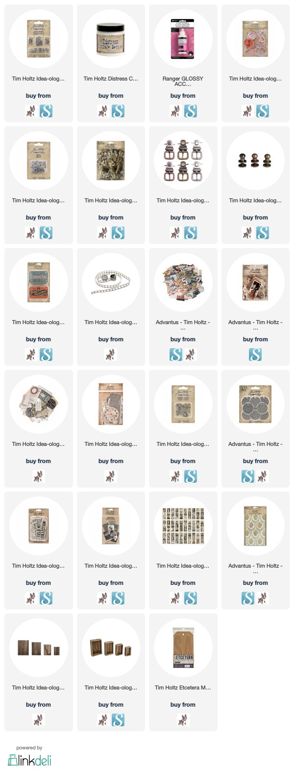
Two pieces that kick started my story were the Drawing Pins Trinket Tin and the Numeric numbers 28. Once those two items sparked a story in my mind, I went about going through the new 2018 product and my older Ideaology stash and pulling items that fit within my story representing Walt Disney's Life.
 1. The hand and bird  are from the Milagros Adornments. They represent Walt's favorite song, "Feed the Birds" from Mary Poppins. It was written by two of Disney's most famous song writers, Robert and Richard Sherman. They had offices in the same building, and on the same floor at the studio as Walt's office. On Friday afternoons  Walt would summon them to his office where he had a piano and would ask Richard to play "Feed the Birds" for him.
 2. The Numeric numbers 28. This is significant because 1928 is the year Walt Disney dreamed up Mickey and Minnie Mouse.  They turned 90 last year. "I only hope that we don't lose sight of one thing - that it was all started by a mouse." - Walt Disney
3. The Railroad tickets from the Ephemera packs because Walt Disney loved railroads.
4. Admit One ticket ephemera representing the admission tickets to Walt's movies and his them park, Disneyland.
5. The Found Relatives photo card of the boy and dog because it reminded me of pictures I've seen of Walt as a boy and because he loved animals.
Photo Credit: Ohmydisney.com
6. The Quote Chip - Dreamer of Dreams because dreaming is a huge Disney theme.

 7. The Quote Token that says "your past does not determine who you are. your past prepares you for who you are to become." This quote so represents Walt's life. He has so many failures, trials, and difficulties, but he persevered and accomplished his dreams in the end.
8. The Drawing Pins Trinket Tin was perfect because I knew Walt and other animators would have used drawing pins to hold their paper in place when drawing their animations.
 9.  The Design Tape with the Red Cross on it represents Walt's time driving an ambulance for the American Ambulance Corps, a division of the Red Cross, in Europe as a 16+ year old  in WWI.
Photo Credit: Chicagoredcrossstories.wordpress.com
10. Photo Booth photo with a boy and a dog was keeping with the boyish dream/animal lover theme.
11. The postcard in the background represents Walt's time in Europe since it was from France and I'm sure he wrote home during his time there.
12. The milk cap represents Walt's boyhood home in Marcelline, Missouri.
 13. The stamp with Abraham Lincoln on it was chosen because Lincoln was Walt's favorite president. As a boy, for school projects he would dress up as Lincoln with a school friend. He even made his first animatronic to be Abraham Lincoln in a show called Great Moments with Mr. Lincoln for the 1964 World's Fair. A modern version of this same show can be seen at Disneyland's Opera House.
Inside the tin I added several pieces from Ephemera Expedition and Layers Collector.
14. Photo Booth - these photos reminded me of a young Walt and Lillian Disney. Walt was known for his thin pencil mustache and his signature fedora.
Photo Credit: thefedoralounge.com
15. I also added a school report card several movie tickets, a piece of Film Strip Ribbon.
16. Once piece included from the Collector Layers is a bookkeeping page that is in the red. I included that because finances and bankruptcies were something Walt Disney and his brother Roy Disney had to endure and recover from many times during their lives.
The Trinket Tin is sitting on a large Vignette Box and Large Vignette Panel that have been nailed to the bottom of an Etcetera Tag with the nails from the Vignette Hardware.
17. The birds on the top of the Vignette Panel go along with the Feed the Birds theme.
18. The panel and box are held together by Film Strip Ribbon that has been altered with the tiniest of the paper dolls. I wanted it to look like actual films representing all of the Disney films that have been a large part of the base that held the Disney Corporation together from the beginning.
To put the paper dolls on the film, I attached them to white paper, then secured packing tape over them. I really burnished it onto the paper dolls so there were no air bubbles.
Then I soaked them in warm water and rinsed them under the tap as I worked the paper off the back of the image leaving a transparent paper doll.
I attached these to the back of a film ribbon with Glossy Accents.
19. I added Gears to go with the steam engine/railroad theme.
20. The Pen Nibs to go with the animator theme.
I attached the film ribbon around the Vignette Box with some Ideaology Buckles, because with Disney it is all in the details.
That is how I design. I have to have a story in my head to make it work. So although I don't always tell the significance of everything in my designs, there is usually a reason for the things I pick to be in a piece of art. It might be a very detailed piece like this, or it might be a simple card, but I always have a back story....which is also a Disney thing.  They have a backstory for everything that most of the guest never notice, but it's there if you look.

So thank you so much for taking the time and looking at the details with me today. It was really fun to get to share them with you.
Tami

I am an affiliate with Simon Says Stamp and Scrapbook.com so the links below send you to one of those stores depending on which logo you choose.  If you wish to purchase something from either store and use one of my links below, I get a small percentage of your order, at no additional cost to you. This helps me to defray the costs of this blog and the ideas and tutorials I post here, and your help is greatly appreciated! Thank you!