Saturday, June 27, 2009

Thinking Inking Week 2 Part 1

This week we are focusing more on embossing powders than we are the inks, but that's okay, it was fun to try a few of these things. The main focus Jennifer had for this part was to have us experiment with embossing powders without using stamps.

There were several things she wanted us to do, so I made three cards with the different techniques.

This first project I made kind of cracks me up! I don't really celebrate Halloween, but I ordered a bunch of paper from Cosmo Cricket last week and they sent me a few little baggies with some of their paper pieces, chipboard and ribbon. Not a lot, but just enough to make a card. So since one of them had Halloween paper, and I had just bought a Tim Holtz Halloween stamp set for the barbed wire stamp (stay tuned for that card which is in progress!) I decided to give it a shot and I love it!


This technique we were to put clear embossing gel on the flower, and then cover the flower in clear embossing powder. When heated, it gives the flower a very shiny appearance. I also stamped the bats in Spiced Marmalade and embossed them with black embossing powder. The Happy Halloween is inked in Worn Lipstick Distress Ink and embossed with Concord Grape Distress Embossing Powder. Thanks Cosmo Cricket for the free stuff!


This technique we were supposed to use Utee on an embellishment to make it look like a faux acrylic embellishment. I bought the wrong kind of Utee - the pearlized instead of the clear (I didn't know there were different kinds!) I finished the technique anyway and it goes with the cream in the paper, so it's all good!


This last card is currently my favorite. I took some really old, cheesy paper I had and inked it all with Antique Linen Distress Ink. Then I copied an old vintage 4th postcard. I liked the way it said 4th of July already on the card, so I carefully went over it with an embossing ink pen and embossed it with antique gold embossing powder so it would stand out. Then we were to take a circle of paper and keep embossing it over and over with embossing powder until it was thick and gooey, then stamp an image in the center to make a faux wax seal. I used antique gold again and a star. For Week 2 part 3 we were to emboss on metal. I took three very bright metal stars and heated them and then dipped them in the antique gold embossing powder until they matched the seal.

I think I like this one so much that I may not be able to give it away.

Lots more fun projects from Jennifer and today begins week 3!
Thinking Inking Week 1 Part 3

Part three of week one was a little messy. You put ink from three different colored ink pads onto a nonstick craft mat, then spritz with water and carefully place your papers into the wet ink. This lightly colors your paper pieces and gives them an interesting look. We also did the water color stamping this week again.

Here is my take on this technique and my scraplift of Jennifer's card.


I made a celebrate card and used Scattered Straw, Faded Jeans, and Fired Brick Distress Inks to make make card and to stamp. I wanted it to have a fun, happy feel, and one that kind of fit with Disney's Celebrate theme this year, so that was my inspiration.

Only a couple more techniques and I will be caught up with the rest of the gang!

Thinking Inking Week 1 Part 2

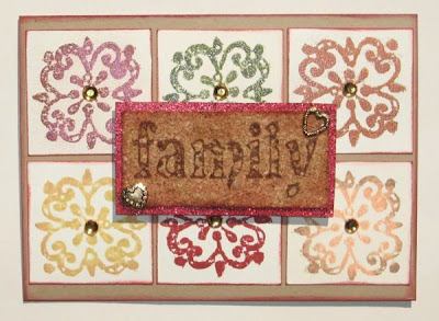
Week two of the Thinking Inking class was to use Distress Inks in stamping. So Jennifer wanted us to use several techniques to do this. Her sample was a layout that displayed all of the techniques, I just made a card instead. Again, if you are interested in the class, the title of this blog entry is a link to the thread on Two Peas in a Bucket.


I will describe the techniques from upper left to right and then lower left to right. I used two stamps from Inque Boutique/Darice.

1. Stamp with Fired Brick Distress Ink, then rub on some red perfect pearls. The perfect pearls give it a great shimmer.

2. Stamp with Peeled Paint Distress Ink and then cover with clear embossing powder to bring out the color.

3. Stamp with Spiced Marmalade Distress Ink and them embossed with bronze embossing powder.

4. Ink the stamp with Scattered Straw Distress Ink, then add a little Tea Dye Distress Ink around the edges. Spritz the stamp with water and it makes a water color image.

5. Just stamped with Fired Brick Distress Ink.

6. Same technique as #4 - inked stamp with Dried Marigold Distress Ink, then added a little Vintage Photo around the edges, spritzed with water, then stamp. Makes a water color stamped image.

7. Is the the family stamp in the middle of the card. She wanted us to stamp on cork and see how the ink showed so well on it.

I'm having a great time playing with all my Ranger/Tim Holtz goodies and actually using a lot of the stamps I have that I never use!

Friday, June 26, 2009

Thinking Inking Week 1 Part 1 Distress Inks

Two Peas in a Bucket has asked Jennifer McGuire to do a 9 week class on Distress Inks, Stamping, Embossing Powders and such. I got to the party a little late as they are in the second week, but I am going to plod along and finish as much as I can. The title of this blog entry will link you directly to the thread on Two Peas.

These are my projects for Week 1 Part 1.


One of the first techniques was just to apply distress ink to paper so you could see how it changes the look of something. We were to take a bright colored paper and see how it could alter it just by applying some ink. I covered some old American Crafts and some Basic Grey paper with Vintage Photo Distress Ink.


The stamp is from Close to My Heart.


This technique is called Water Splotching. I inked up a tag and then you sprinkle water onto the tag and it creates these cool splotches. Then we were to stamp in a paper flower. The Thank You and flower stamp are both from Inque Boutique/Darice.


I really liked this technique. I inked a tag with three different colors (Concord Grap, Spiced Marmalade and Worn Lipstick) then you ink up a stamp with clear embossing ink and spritz it with water (this is a Tim Holtz flourish stamp.) Once it is sufficiently wet, you stamp n the ink and let it work its magic. I also used the fist technique here as well and inked the bright Basic Grey paper with Spiced Marmalade.


The last technique was masking. Since I didn't have any masks handy, I made some. I took an old Bo Bunny cardstock sticker and punched out various circles. I inked the tag with some Broken China and a little Shabby Shutters. then I applied the mask circles and covered the entire tag with Faded Jeans. Since I decided to make this an underwater feeling card, I stamped the card front with the Tim Holtz flourish stamp using the water technique and also with some ink so I could apply some perfect pearls to the top. This card needed some shimmer. The shells are QuicKutz and when I was all done, I spritzed the entire thing with a light misting of white Perfect Pearls. I curled the ribbon by heating it with my heat tool.


What a great class! Jen is really creative and I am having a blast! Stay tuned for more Thinking Ink projects from me shortly!

Friday, June 19, 2009

Twinchies

A scrapbooking friend of mine posted some wonderful little things called TWINCHIES on her blog about a year ago and I have to tell you, the minute I saw them I was enthralled. Twinchies are little 2 inch x 2 inch squares that are stamped, painted, collaged or otherwise decorated. I began dreaming of twinchies as I slept, planning all the wonderful little ways I could fit as much cuteness as possible onto one 2" square.

Twinchies grew out of what was originally the ATC craze.
ATC (Artist Trading Cards) are 2.5 inch x 3.5 inch "Cards" that are stamped, painted, collage or otherwise decorated. There are many paper crafters who alter ATC's and trade them with people in their area, the internet, even world wide.

Next came the Inchie craze.
Inchies are little 1 inch x 1 inch squares that are stamped, painted, collaged, or otherwise decorated. A one inch square doesn't leave a lot of room for embellishment, but I am quite surprised at the amount of decor some paper crafters can fit on an inch.

For those of us who like a little bit bigger canvas to work with, the Twinchies were just the thing. I talked to a group of friends who do Disney scrapping with me and they were
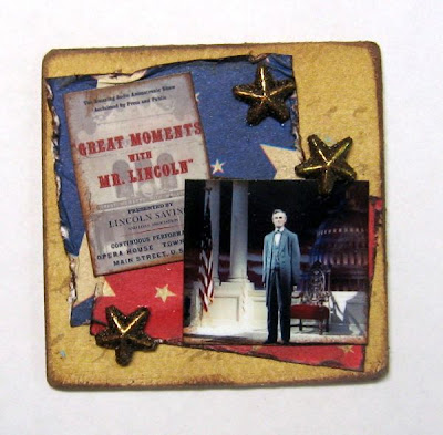
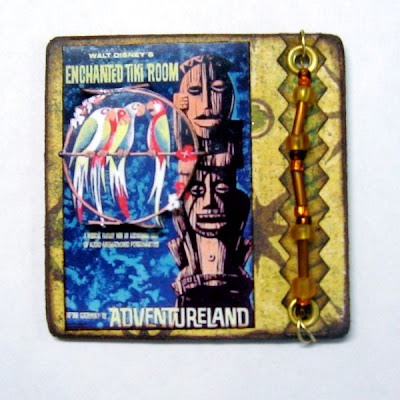
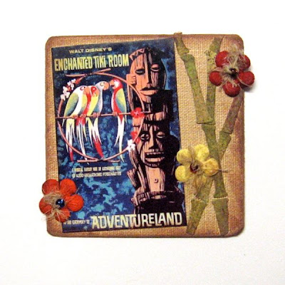
game to have a Twinchie swap. The only rules for the swap were that the Twinchie had to be exactly 2x2 and that it was Disney related. Here are my Disney Twinchies. Just so you know, it is very difficult to take a good picture of something that is only two inches big, so please bear with the results.

I made two versions of this Great Moments with Mr. Lincoln before I decided on the second one for the swap.


I had the same problem with the Tiki Room Twinchies - I made the first one with the beads, but went with the second version with the bamboo and flowers for the swap.


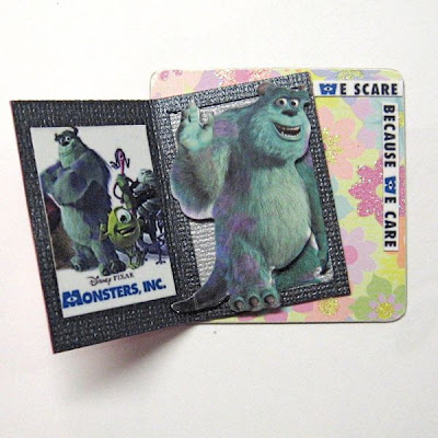
I had a lot of fun with this one! I copied an idea I had used on my Monsters, Inc. ride layout and I made Boo's door for all the twinchies.

This twinchie is interactive - it opens up and reveals one of the monsters from the movie. I used the EK Success sticker packs and so each person got a different monster.


The rest of these twinchies were my initial attempts at them. I used old attraction posters from Disneyland and other left over odds and ends.


One of my favorite extinct rides. On this one I used aluminum foil duct tape on cardstock and embossed it.


This is one I made as a blog give-away on my Disneyland blog last summer. For everyone who posted a comment, I put their name in a drawing for an Indy twinchie. I was doing a review of the Summer of Indian Jones in Disneyland's Adventureland.


Then I decided to make some to use on layouts. These three were for a Grizzly River Run layout that I never finished (some day!)


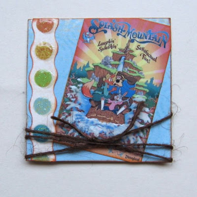
These I made for a Splash Mountain layout which you can see below.


So that has been my venture into the world of twinchies. I really love making them and hope to make a few more when I get a little more time.

BEWARE! Once you begin making these little artistic wonders, you will become addicted and may loose sleep due to hours of dreaming about new designs for them!

Saturday, June 6, 2009

Storytellers Cafe Critter Breakfast - Disneyland


This is a layout I just finished about the Storytellers Cafe Critter Breakfast we attended for my birthday in January. I have a lot of photos still to scrap, one or two more two-pagers, but this was a good start!

I linked the title of this entry to my Disneyland blog so you can read more about it if you are interested in attending one yourself. But since this is a scrapping blog, I figured I would focus on the pages, not the topic of the pages.

I ended up purchasing about 12 different papers for this layout and this is what I finally ended up with. It is kind of a hodge podge of old, outdated paper and I always love the challenge of putting old stuff to good use.

First, I needed some good background paper. I tried several different papers, and ended up making my own. I used cream cardstock and then a Tim Holtz technique of spritzing the paper with Distress Inks and Color Wash ink.

To do this I put 3 drops of Scattered Straw, and 3 drops of Vintage photo Distress Reinkers into a Ranger Mini Mister, then filled with water.

I spritzed the entire paper and dried.


Then I VERY lightly misted the paper with the Espresso Color Wash. Be sure to do this lightly as it will easily beome way too much and overwhelm the paper. I just wanted a few dark brown spots to make the background interesting.


As you can see, the spritzed paper looks a lot different than it did when I started. It did tend to curl the sides up even when I dried it with a heat tool, so I ironed it with a dry iron once all the ink had dried.


When the base was finished, I added the pieces of patterened paper and sewed them on with my machine. As I said before, I used a lot of old patterned paper for this because I like the challenge of taking something old and making it a little different so I can use it. The plaid paper is by Junkitz, typed paper is Jenni Bowlin (this is the only new line), dot paper is My Mind's Eye, and all of the ginham paper is very old Paper Patch. I inked all of the older gingham paper and the dot paper with Ranger Distress Ink Antique Paper. This gave it a different look and it went with the feel I had in mind for the page.


The leaves are cut from some colored cardstock called Coredinations by Reminisce. When you sand the edges or if you emboss it and then sand it, the color on top comes off revealing the core color of the cardstock underneath. I love it! It comes in White Wash, Chocolate and Black too!


Lastly, I punched flowers from the gingham paper and some black corrugated paper and layered them with buttons over some burlap squares that I also tinted with the Espresso Color Wash. I layered some tags from an old tag set I bought at Walmart and journaled on a Tim Holtz Journaling Ticket. The small tag is a plain brown tag that I stamped with a Tim Holtz stamp from Stamper's Anonymous and the Mickey tag is punched from some old type paper.

I distressed the pictures by scraping along the side of each one several times with an awl and then sanding them lightly before adding a little Antique Paper Distress Ink.