Monday, May 31, 2010

Little Dancer


I made this for the Graphic 45 Renaissance Faire contest. You were to make a project using that line of paper. I thought it went perfectly with the pictures we took last November at the Boston Museum of Fine Arts. We walked into a room and suddenly I saw it -- Degas' Little Dancer! It was stunning!

The pictures just don't do it justice. If you ever get a chance, you must go see this amazing bronze sculpture in person. He actually used a green ribbon and bronze dipped fabric for her outfit.

Along with showcasing this piece of art, I wanted to add some of my own artwork to the page. I found this rose tutorial online and wanted to make some to put on this page. Here is how you make them.

First, punch out 8 flowers or scallops. I made them in two different sizes. I used the EK Success punches.

Then spritz with water. I spritzed with water and some bronze perfect pearls for a tiny bit of shimmer.
Then crinkle each one into a little ball.
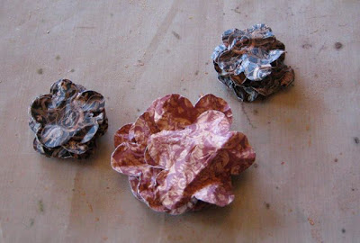
They should look like this when you are done.
The flatten them back out and stack them into a stack of 8. If you have double sided paper, you might want to flip them over every other one so that you can see the other side. I didn't do that because I didn't want it to be too busy for this layout.
Then using an awl or paper punch (as usual I couldn't find my Tim Holtz paper punch, which is my favorite!)
Stick a long brad through the hole and open the back to fasten all the papers together.
Then starting with the top petal, pull it up and squeeze it tight in the center.
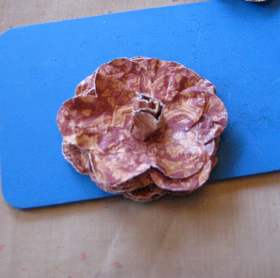
Then do the same with the second petal.
And once you have squeezed all the petals around the center, it will look like a rose bud.
Then very gently, take it and spread the petals out and down to form the rose blossom.
Here is one of the smaller ones.
And the larger red one. I added some Prima swirls to fit with the feel of the metal sculpture and the grace of the dancer.


Thanks Graphic 45! This was a fun challenge!
Sunday, May 23, 2010

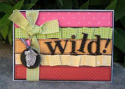
Wild!

Serendipity Scrapbooks is having an online crop this weekend. It is an old TV shows theme, so all the challenges are based around old TV shows like Star Trek, Brady Bunch, The Adams Family, etc. Every once in awhile they break in with a "commercial break" or a mini challenge that is only for 1 or 2 hours.

My friend Susan posted this commercial break for Fruit Striped Gum.

Basically, you had to make a card using a red, green, yellow, orange and pink stripe and include one animal on your card. It sounded like a fun way to use up some stuff in my stash, so here is my take on the challenge.


Just for the fun of it, here is a link to one of the original Fruit Stripes Gum commercials.

Thursday, May 20, 2010

Quacked - My Minds Eye


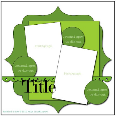
This layout was for Blog Challenge #11 on the My Mind's Eye blog. It was an anything goes challenge. You could use any My Mind's Eye products. I used all My Minds Eye paper from the Tres Jolie and Magnolia Collections.

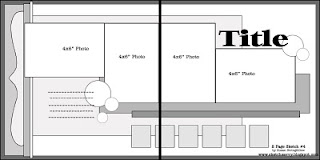
You were supposed to follow this sketch.

I cut some of the flowers out of one of the Magnolia papers and then layered them with felt and added a little bling.


This was a fun, quick layout to do and I was able to get some recent pictures scrapped that we took with Donald Duck at Disneyland last month. Thanks MME!!

Orange Stinger - DCA


On one girls day at Disneyland Resort, we decided to go on some of the attractions we never usually try. This was our ride on the Orange Stinger (RIP). The Orange Stinger is no longer. It was retired and has been revamped as Mickey's Silly Symphony. I thought this was going to be a rather benign ride, I mean, it's just a bunch of swings that go around in a circle! But when we got off I was completely nauseous. I vowed then never to do the Orange Stinger again.
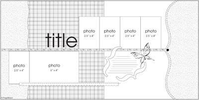
This Page Maps sketch from November 2009 was perfect for this Breaking Free paper from My Minds Eye.

I used SCAL on my Cricut to cut out the title and then added some Bazzill flowers, felt and Prima bling.

Screamin'!


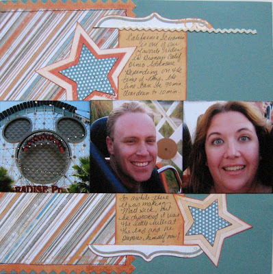
Woo hooo! We love California Screamin'! I loved the oranges, teals and greys of this Breaking Free paper from My Mind's Eye.

I used this page maps sketch for this layout:


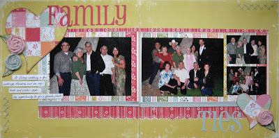
Family Ties - Cosmo Cricket


This is another layout using Cosmo Cricket Honey Pie. I wanted to use the quilted heart technique again and thought it went so well with this paper.

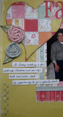
I added a couple of areas with some simple cross stitching for some texture in the corners, and used the twisted flower technique for even more. I love the combination of the printed stitching on the paper, the cross stitching, the machine stitching and the flowers.


I had planned on making this a grandma layout, and then a few weeks ago my cousin got married and all the aunts, uncles, my parents and my grandma posed for a family photo shoot, and I immediately knew they would be absolutely perfect for this layout!

Tea Time - Cosmo Cricket


This was a fun layout to do. Simple, light color scheme, and the fun pennants. I really like it. There are no techniques or anything, just a simple, straight forward two pager to scrap a memory for several years ago.

I used Cosmo Cricket Honey Pie for this layout, and my mom made the scalloped circle for the center.

This is of a tea time we had with our friend Gerri Ann and her mom one Saturday morning at our favorite little tea shop, The Four Seasons Tea Room. They make the best scones and have the best food of almost any tea we have ever been to except for their neighbor, the Rose Tree Cottage.

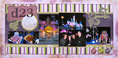
D23 First Anniversary Party!

On March 10, 2010, we went to Disneyland for the first D23 Anniversary event. We met some Disney legends, got pictures with a bunch of rare Disney characters, and ate some yummy Disney desserts. You can read more about the actual event and some some pictures on my Disneyland blog.


Yet again, the Afternoon Tea paper from Scrap Within Reach was the perfect color scheme, and yet again, my friend Susan came through with the perfect sketch! Be sure and visit her blog, Sketch Savvy and check out all the great sketches.

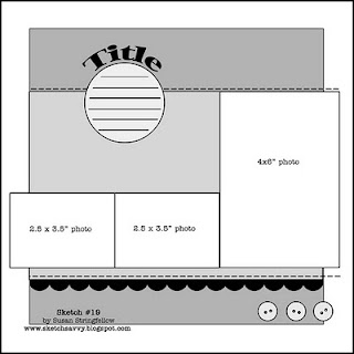
For this layout I chose to use Sketch #19 and because it was a one page sketch, I decided to turn it into a two pager.


Instead of the stitching, I added the line of ribbon across the top, and then did do some machine sewing on my layout.

Because there was no title on the second page, the top corner needed a little something, so I decided to stamp and emboss a design. I found this stamp set to be just the perfect thing for each of the top corners of this layout. I stamped the image on the green cardstock with clear embossing ink, then embossed it with purple distress embossing powder. If you've never worked with Ranger's Distress Embossing powder, it is really neat! It doesn't get shiny, but it is a dull, very textured feel and I love it.

The stamp set was also designed by Susan for Inque Boutique/ Darice. It is called Ornaments (#50391).

I really loved the simplicity of this layout. It wasn't cluttered and really let the colors of the paper and the pictures shine through.

Tapas!

I has so much of the Afternoon Tea paper that I decided to make a few more layouts with it.
A few weeks ago when we went to DCA for the Food and Wine Festival, we made our way over to Stage 12 for the tapas (appetizers) tasting.


Again I turned to one of my friend, Susan's sketches. I thought this one would be perfect for showcasing the many different things we tasted that day. Check out her blog, Sketch Savvy.


I left it pretty simple since I decided to make some kits out of this layout. But it does the job and I love it!


And if you would like to try some of the delicious little tapas pictured here, you have until may 31 to get to DCA to try them! I wrote a detailed critique on my Disneyland blog.

Monday, May 17, 2010

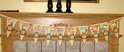
Summertime Banner - Graphic 45

I woke up one Saturday morning a couple of weeks ago and had this banner in mind. I really wanted to use my QuicKutz banner die and the Graphic 45 On The Boardwalk paper. Unfortunately I had to wait a couple of weeks to get the time to make it. This last weekend I spent a good portion of the entire weekend at my LSS for their National Scrapbook Weekend Crop. So, I got everything cut and ready to go for the crop and put it together on Saturday.


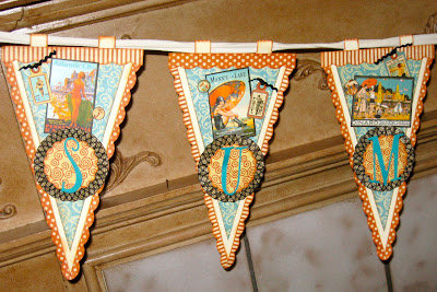
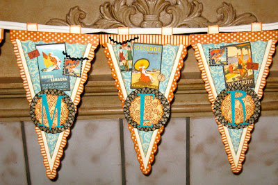
Hopefully you can see some of the wonderful vintage beach tags and posters from some of the papers. I chalked the edges with Ranger Distress Ink in Rusty Hinge (my new favorite!)

To see more details, click on the picture and it will get bigger.


I used more QuicKutz dies to make the scalloped circles on top of the fans, and the letters are QuicKutz Katie Grand.


I'm thinking about searching through the disaster I call my scraproom, and finding some tiny sea shells that I bought on my last vacation and adhering them to a few of the banners. Still undecided on that though.


This was a fun project (although it did get a bit tedious at times with all the scoring and inking!) and I'm so thankful for the weekend of cropping so I could get it done. That's one of the 102,593 projects I have planned that I can actually cross off the list! Woo hooooo!

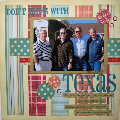
Don't Mess With Texas

Yeah, pretty cliche, I know! But I really wanted to get this picture scrapped and nothing else was coming to mind. These are three friends from Texas that come and stay in out home for a week every few years. They call us and send us stuff in-between and they crack us up! Good guys!


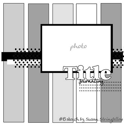
For this layout I used the Sketch Savvy #6 from my friend Susan's sketch blog. I ordered some paper from Miss Paper Jane (Cosmo Cricket) and they sent me a bunch of free strips of Jack's World paper. I bought a few more pieces from my LSS and thought they would be perfect for this sketch! Thanks Miss Paper Jane!!

I added a few paper circles and some grommlets and called it good. It seemed like simple was the best way to go with this one.

Friday, May 7, 2010

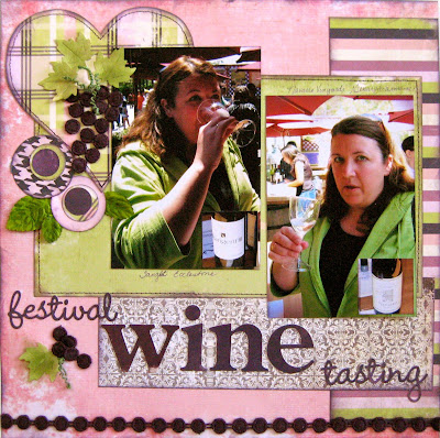
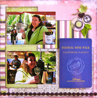
Festival Wine Tasting


If you know me, you know that I am a picky eater and that I hate the taste of wine and beer. Well, my Disney travel agent friend, asked me to go to Disney's Food & Wine Festival at California Adventure and tell her about it. I have been blogging about my experiences and you can read all the details about my wine tasting on my blog Disneyland Diva.

Even though this sketch by my friend Susan Stringfellow has a heart on it, I decided to use it anyway as kind of an ironic twist on my wine tasting adventure. You can find this and many other fabulous sketches on her sketch blog, Sketch Savvy.


Since I had a lot of this Afternoon Tea paper from Scrap Within Reach, I decided to use it for my wine tasting pictures. It matched my outfit and the wine theme. And no, I didn't plan it that way, it was just a little bit of scrapping serendipity.


In order to include mutlitple pictures and not clog up the layout, I had the wine bottles printed as wallets and then punched them out with my square CM punch. Then I adhered them to the bottom corner of each photo so I knew what expression went with which wine.

In the bottom corner is my wine passport. They stamp it each time you taste a wine because you only get to taste 4 of the 16 offered unless you pay another $10. I wrote my immediate reactions about each wine in the passport at the time so I'm pretty much just using that and my expressions as my journaling.


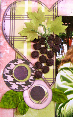
The cute wine colored trim came with the paper, and so I thought it pulled the color scheme together with a line of it across the bottom of the layout, but I had about a foot left over, so I cut the little circles apart and used them to make a bunch of grapes and some little grape bunches in the top and bottom corners. It was just the embellishment it needed!


I had a great time making this layout and remembering how horrible the wine tasting was. It was worth it though to be able to make such a fun layout about the experience.