This is a masculine shaker card that I thought would be good for a a guy's birthday card or father's day card, especially for a cyclist.
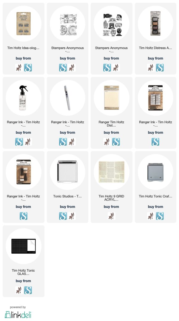
I used two of the newest stamp releases from Tim Holtz and Stampers Anonymous called Eclectic Adverts CMS372 and Inventor 7 CMS374.
I stamped the gears from the Inventor 7 set onto a piece of Distress Mixed Media Heavystock in Black Soot Distress Archival Ink. Then I colored the paper with Pumice Stone, Walnut Stain, and Hickory Smoke Distress Inks using the Wrinkle Free Distress Method.
Then I used the Stacked Lables dies from Tim Holtz and Sizzix, and I
chose one that fit nice around the Victors Tires Advert. Then cut out a
window from the center of the piece. I added a piece of acetate behind
the opening and then dimensional adhesive all around the outside edges
to make a window for the shaker portion.
I colored a second piece of Heavystock with Hickory Smoke, Evergreen Bough, and Walnut Stain. Then on a stamp platform, I laid the gear frame over the green piece where it would go and I positioned the Victor's stamp in the center of the opening. Then I removed the window and stamped the advert in Black Soot Archival Ink.
Before attaching the window, I needed the shaker bits, so I stamped several of the wheels from the bike onto some Heavystock. Then I cut them out and used those as the shaker bits.
To finish it off, I added my usual bit of sewing, and some of my new favorites, the Hardware Heads.
Thanks for checking out this card! Pretty basic for a shaker, but easy enough to duplicate.
Tami
I am an affiliate with Simon Says Stamp and Scrapbook.com so the links
below send you to one of those stores depending on which logo you
choose. If you wish to purchase something
from either store and use one of my links below, I get a small
percentage of your order, at no additional cost to you. This
helps me to defray the costs of this blog and the ideas and tutorials I
post here, and your help is greatly appreciated! Thank you!
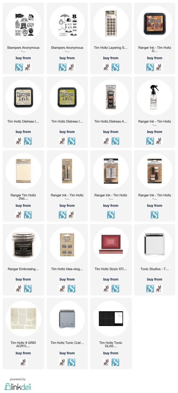
Two of the new stamp sets released this month from Tim Holtz and Stampers Anonymous are the Distinguished CMS371 and Eclectic Adverts CMS372. These are both fabulous stamp sets with so many delightful vintage images. They make some wonderful masculine cards, which is what I was going for with these two cards.
To make the background on this hatter card, I stamped the various hats from the Distinguished set onto a piece of Distress Mixed Media Heavystock with the Warm Archival Inks - Hickory Smoke, Vintage Photo and Ground Espresso. Then I did the whole Wrinkle-free Distress method with Antique Linen Distress ink. I believe I threw in a little Vintage Photo in their too. If you look closely, you will see that I randomly stamped the wording on the set all over the background, but in Distress Ink so that when it got wet it would run and lighten.
For the focal point, I stamped the Nicholai Michaelis Hatters stamp from the Eclectic Adverts, onto a piece of Distress Mixed Media Heavystock. I stamped it with Black Soot Archival Ink and then did a weird technique that I'm not totally sold on, but I'll explain it anyway. LOL!
I stamped the hat image in Black Soot Archival and then immediately applied Ranger Superfine Black Embossing Powder. You may be saying to yourself, it doesn't look embossed to me! And that would make me happy, because I wasn't going for a traditional embossed look. I heated it so it would melt into a shiny embossing. But then I remembered in one of Tim's tutorials years ago, or maybe a Creative Chemistry class (?) I don't know, but he said that we can't heat embossing powder too much or it will soak in to the paper and kind of disappear. I wanted to see how it would look if I did that. So I just kept heating the embossing powder until is soaked into the paper. It's different. LOL! I told you I wasn't sold on this technique. It does look a little old and worn and matte in some areas with tiny little bits of shine peeking through still. So I think it basically accomplished what I wanted was a look that was more than just stamping with Black Soot Archival as there is a tiniest bit of texture, but it doesn't look shiny and new embossing.
I finished the piece with alcohol inked Ideaology Hardware Heads, and a very neatly tied bow from a piece of dark brown twill I had in my stash. It is supposed to mimic a hatband.
This collar card was made to give to a friend. The frame was made by lightly coloring a piece of Distress Mixed Media Heavystock with Crushed Olive Distress Ink. Then I added more ink on top of it through the THS097 Plaid Layering Stencil. I cut the center out with one of the Stitched Rectangles to make a frame. On a second piece of Heavystock I applied Antique Linen Distress Ink using the Wrinkle-free Distress method. Then I stamped 5 of the collars from the Distinguished set and the Garden City Collar from the Eclectic Adverts in Black Soot Archival Ink. I watercolored them with Distress Ink, popped the frame on and added two buttons representing the buttons that would be used on collars.
Very simple, but I like it!
There are two examples of how I paired these two really great vintage, masculine stamp sets. As always, I appreciate you stopping by!
Tami I am an affiliate with Simon Says Stamp and Scrapbook.com so the links
below send you to one of those stores depending on which logo you
choose. If you wish to purchase something
from either store and use one of my links below, I get a small
percentage of your order, at no additional cost to you. This
helps me to defray the costs of this blog and the ideas and tutorials I
post here, and your help is greatly appreciated! Thank you!
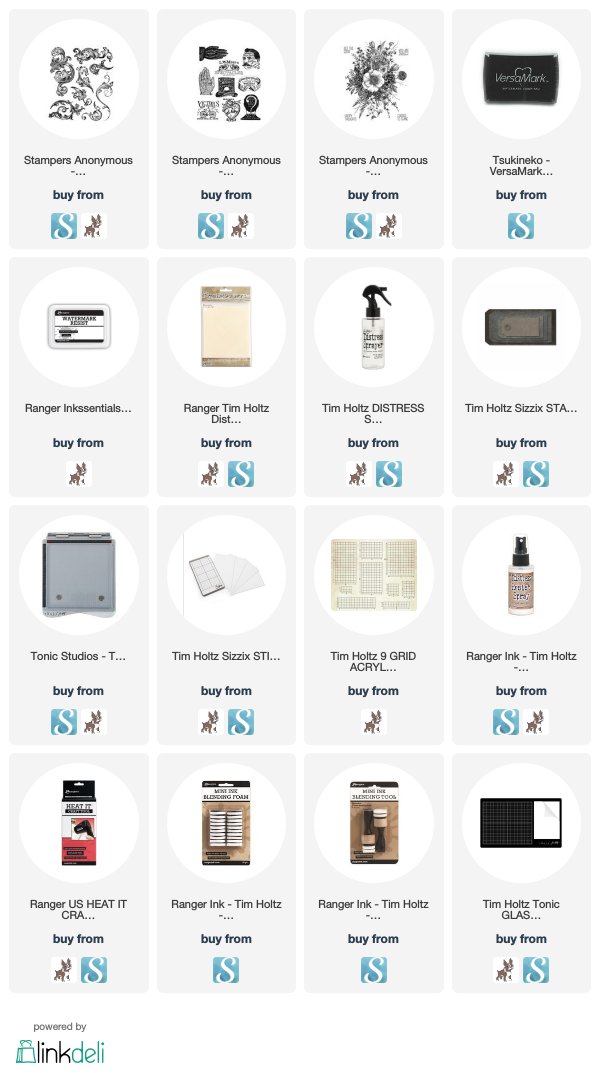
This is a card I made for a friend using the new Scrollwork CMS367 and Eclectic Adverts CMS372 stamps from Tim Holtz and Stampers Anonymous.
To make the background I started by putting a piece of Sticky Grid onto my Stamp Platform because I wanted the scrolls to cover the entire surface and didn't want the magnets in the way.
Then I put the piece of Distress Mixed Media Heavystock onto the Sticky Grid.
I arranged the scrolls from the Scrollwork stamp set.
Then stamped it with the almost clear Watermark Resist Ink. The darker one seen below was stamped with Hickory Smoke Distress Archival just to see what would happen.
These pictures were taken as I was experimenting with this technique to see if Distress Spray Stain would work with this technique as well as the Distress Ink Pads on the nonstick mat.
After I sprayed the Distress Stains onto the paper, I spritzed them with a lot of water to give it a soft feeling.
I also used a towel to soak up any of the really dark spots. In the photo above you can see how differently the Archival Ink and the Watermark Resist react differently with the Distress Stains.
Then I dried the ink. I didn't do the water spots on this as I wanted the colors to blend together lightly and smoothly.
And here it is. You can see how there is a little resist that gives it a distressed look, but the ink also soaks in the color. It's really cool! I love it.
Sorry it is sideways...I can only edit and upload video on my phone and I couldn't figure out how to rotate it.
Here is a quick little video showing how I made this type of background for the card below. I applied Distress Ink to the nonstick
mat on my glass mat and sprayed it with water and then pressed the
stamped paper into the ink. I did this several times until I got the
saturation I was looking for.
I believe for this card I used the colors Brushed Corduroy, Chipped Sapphire, and Vintage Photo.
I cut a small tag from the Stacked Tags die set and then stamped the hand advert onto it from the Eclectic Adverts stamp set, in Black Soot Distress Archival Ink. The I colored the tag with a little Chipped Sapphire and Brushed Corduroy. To make it stand out on the card, I sprayed it with a layer of Distress Resist Spray. I tied a piece of jute through the tag and popped it up with dimensional adhesive.
I made another card for a another friend using the same technique but with a different stamp -- the Glorious Garden stamp. It ended up being very soft and subtle compared to the scrolls.
I also experimented with this stamp the other day using the Watermark Resist Inks with the Distress Spray Stains and Spray Oxides. The result was a very different look than the one above, but it's always fun to try new things with techniques.
I hope this inspires you to just play around with your stamps and inks and see what happens! As always I appreciate you taking the time to stop by.
Tami
I am an affiliate with Simon Says Stamp and Scrapbook.com so the links
below send you to one of those stores depending on which logo you
choose. If you wish to purchase something
from either store and use one of my links below, I get a small
percentage of your order, at no additional cost to you. This
helps me to defray the costs of this blog and the ideas and tutorials I
post here, and your help is greatly appreciated! Thank you!
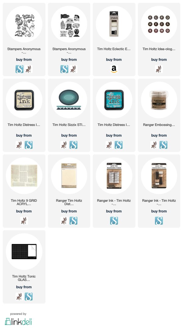
One of the new stamp sets from Tim Holtz and Stampers Anonymous that is available this month is Scrollwork CMS367. It is a full set of various scroll shapes that can be used individually or as seen on this card, I stamped most of the scrolls so they made a vintage looking background.
To make the background, I colored a piece of Distress Multi Media Heavystock with Antique Linen Distress Ink. Then I stamped the various scrolls onto it with Distress Embossing Ink and embossed it with Superfine Gold Embossing Powder. Then I watercolored inside the scrolls with Distress Ink Peacock Feathers.
I cut the center out with two different sizes of the Stitched Ovals dies. Then in Black Soot Distress Ink, I stamped the spectacles image from the Eclectic Adverts CMS372 which is released in March 2019. I watercolored just the word spectacles.
As I stated in my last post, I like having even the tiniest bit of a story with my projects. With this one it is the Muse Token with the E for Excellence with the "Spectacles the Best in Use." I picked the E because it is the top letter on the eye charts you have to read when getting fitted for spectacles. The excellence on the token goes with the fact that the LM Moses spectacles claim to be the BEST in USE.
I hope you liked what you "saw" on the blog today! Thanks for taking a "peek!"
Tami
I am an affiliate with Simon Says Stamp and Scrapbook.com so the links
below send you to one of those stores depending on which logo you
choose. If you wish to purchase something
from either store and use one of my links below, I get a small
percentage of your order, at no additional cost to you. This
helps me to defray the costs of this blog and the ideas and tutorials I
post here, and your help is greatly appreciated! Thank you!