Are you as excited about these gorgeous new Velvet Trims from Tim Holtz Idea-ology as I am? They are just so beautiful that I wanted to make a special piece of art that I could hang in my studio and just stare at them!
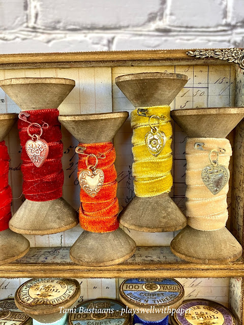
I had a couple of ideas for this project and they all started with these spools. Several years ago, I bought a whole bunch of them from a craft/home decor store near me that was called Beverlys. I was going to make a class project out of them, but never figured one out. So they have been in a bag in my studio closet for 6 years. I knew they would be perfect for this. So then this idea changed from a wreath, to a loooong, end to end altered Vignette Tray, to this stacked Vignette Tray version, which is my favorite!
So where can you get some similar spools, you may be asking. I have not been able to find any that are similar to these in look. They are wooden hour glass spools about 3" tall. I did find some 3"ish tall wooden barrel spools
here,
here, here,
here,
here, and lots of shops on Etsy have them. Good Luck!
This project began by covering the backs of two small Vignette Trays with two pieces of the new Backdrops paper.
Then I put a nice layer of Distress Collage Medium on the bottom of one box and the top of another and I adhered them together. It takes awhile for the Collage Medium to dry and you want these boxes to be completely stuck together, so I used these large clips to squeeze them together while they dried.
Once dry, I covered the entire outside of the now large tray with some of the new Fabric Tape. It sticks so well you don't even need any other adhesive. Just peel and stick.
I put another type of fabric tape on the inside of the boxes. These require a bit of trimming which I did with Tim's Tonic Fabric Scissors and his Tonic Retractable Craft Knife. Once I trimmed it I used this Tonic Retractable Craft Scratcher to fray the edges on the inside and out.
Then ink the edges with Walnut Stain Distress Ink.
I added four of these corner adornments from the Vignette Accents. I buy these practically every time I find myself in an aisle of Idea-ology. I rhad four of these in my stash and didn't realize there is only one in a pack until I was writing this blog. All that to say, you need four if you want it to look just like mine, or none if you want to keep it a simple farmhouse style.
I added two of these handles to the sides. These are also favorites because I have used this one on a lot of my makes. I filled in the holes with two Hardware Heads on each handle.
Lastly, I covered the back of the large box with pieces of the Backdrops papers. You brush a thin layer of Distress Collage Medium on the wood and then lay the paper in place and press it down all over. I sand the edges when it is dry and then ink them.
To decorate each of the spools, you need the Hearts Adornments. You will need two packs because there are fourteen colors and fourteen spools, but the hearts come in a pack of twelve. On a happy note, you will have hearts left for other projects. You also need fourteen Mini Pins and Jumps Rings.
The top tray contains the Warm Velvet Trims. I used about 18" to wrap around the spool. I would try it before you cut yours though and see what you like. I put a drop of hot glue at the top back of the spool to anchor the trim, then wrapped it and made sure it ended again on the back with another drop of hot glue.
For each spool I picked a heart, then attached it to a Jump Ring and a Mini Pin. Once they were one unit, I then chose a corresponding Distress Paint for each color of Velvet Trim. There were a couple of times I mixed two colors to get it a little closer, but that is a little insane and really you can probably just pick one color and it will be close enough. I put a couple of drops of the paint on my fingers and then rubbed it onto all three parts. I rubbed it until it was mostly dry and then I used a dry cotton cloth (inky binky) to wipe off the excess on the raised areas so the details of the hearts showed through.
For these three I used from L to R: Spun Sugar, Worn Lipstick (but I didn't have Kitsch Flamingo so that might be better!) and Candied Apple.
The Distress Paint I used for these from L to R: Aged Mahoghany, Crackling Campfire, Fossilized Amber, Antique Linen.
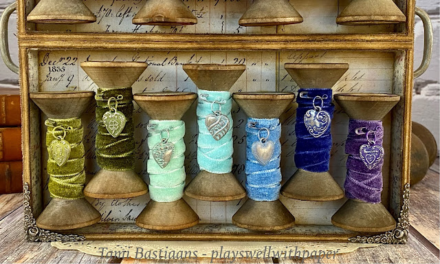
The bottom tray has the Cool Velvet Trims and don't they look wonderful?
For these three I used the following Distress Paint colors from L to R: Peeled Paint, Forest Moss, and Cracked Pistaschio. I love how there were horseshoe and clover hearts for the greens.
For these three I used the following Distress Paint colors from L to R: Tumbled Glass, Stormy Sky, Chipped Sapphire, and Dusty Concord.
The top and bottom of each spool has a spool stamp from the Stampers Anonymous Haberdashery CMS105 stamp set.
You can purchase this stamp set directly from Stampers Anonymous. There are two spool styles and I used both and just alternated them on the spools. The top and bottom art on each spool match through. I stamped them 28 times on Distress Mixed Media Heavystock in Distress Archival Ground Espresso with a touch of Black Soot. Then I watercolored them in the same color Distress Ink as the heart for that spool. I fussy cut them out, edged each one in Walnut Stain Distress Ink and then adhered them in place on the top and bottom of each spool with Distress Collage Medium.
**Alternate Idea** I hope those of you who are interested in making something similar can find some spools that will work. If you end up having to use shorter spools, I would maybe consider using two Divided DrawerVignettes over each other instead of the small Tray Vignettes. That might work with shorter spools.
This was a really fun project to work on and it is truly one of my favorite makes from this release. Thank you so much for visiting my blog today! I greatly appreciate your support!
Tami
I am an affiliate with Simon Says Stamp and Scrapbook.com so the links below send you to one of those stores depending on which logo you choose. If you wish to purchase something from either store and use one of my links below, I get a small percentage of your order, at no additional cost to you. This helps me to defray the costs of this blog, the time, the ideas and tutorials I post here. Your help is greatly appreciated! Thank you!