Showing posts with label Distress Archival Ink. Show all posts

Friday, September 6, 2019

I Put a Spell on You - Monster Reunion

You know I love a good shifter stencil and this Shifter Rays stencil is cool. It works a little differently than the other shifters, so I hope my step out photos help explain this properly. Let's give it a try shall we?
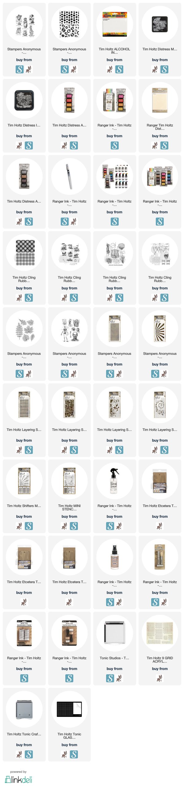
 To begin, this is a variation of the Archival Resist Technique that I posted on a few previous cards. That being said, you still need the Alcohol Ink CARDSTOCK  (not Yupo!) for this technique to work properly.
 I held the Alcohol Ink Cardstock in place with Sizzix Sticky Grid. Then held the large Shifter Rays stencil in place with some Washi Tape so I could lift it to check coverage as seen below.
 With this technique I applied the Hickory Smoke Archival Ink with a Blending Tool. I did not apply it in a circular motion, but rather, went in the direction of the rays.
 When one side was complete, I did the opposite side. Now you can see where I have the poker pointing to the center that the rays are not going to line up perfectly. That really isn't going to matter in the end. Just get it as close as possible.
 When it comes to the shifting on this stencil, you can't just move it down like you do with the other stencils. if you look at the picture above, this was the best I could do trying to just move it down. It's obvious that this is not going to work.
 You need to flip it over and upside down and you can see how now it lines up. If you look at the number I'm pointing to in the top right hand corner, you can see it is upside down and turned over. You can also see the lower arrow pointing to how it is lined up.  Also note that there is a thin line on the sides of the rays that is also masked. That is important to this technique.
 I applied the Dusty Concord Distress Archival to the paper on the right side and then turned and flipped the stencil for the other side.
 You can see that I used the blending tool to apply the Archival Ink. Again, do this with the rays and not in the usual circular motion.
 This is what it looks like once both sides are done. You can see it isn't perfect in the center and that won't show when we are done so don't worry.  Ok now for the resist part of the technique.  I wanted a dark background, so I applied my Distress Ink direct to paper from the ink pad, and I used Black Soot Distress Ink. This ink will color any parts left that are still white.
 Here is what it looked like once the black soot was on the paper. Then I used a clean dry cloth and wiped away and excess Distress Ink revealing the purple and grey Archival below.
This is the final result.  So cool! I love it!
Now I wanted to add something to the background that went with the spell on you sentiment that went with the stamp I was using. So I gathered the Hocus Pocus stencil, transparent texture paste and fine detail silver embossing powder.
I lined up the large Hocus Pocus stencil in the center of the background and secured it.
Then applied a thin layer of transparent texture paste through it.
When you lift the stencil off, this is what it looks like. It becomes transparent once it dries.
While it is still wet, sprinkle the silver embossing powder over it so that it sticks to the texture paste.
Let it dry and then heat it with a heat tool. If you dried it before it is dry it will bubble.
And there is a cool background!
I stamped the image on Distress Mixed Media Heavystock and then watercolored it. After I trimmed it I double matted it with Metallic Kraftstock in black and red and added some messy stitching.  The stars, image and sentiment all cover and weird areas in the background that might have been worrisome when looking at it without all the layers.
I hope you enjoy this different take on the Archival Resist Technique.  It's not just for stamps!
Tami

I am an affiliate with Simon Says Stamp and Scrapbook.com so the links below send you to one of those stores depending on which logo you choose.  If you wish to purchase something from either store and use one of my links below, I get a small percentage of your order, at no additional cost to you. This helps me to defray the costs of this blog, the time, the ideas and tutorials I post here. Your help is greatly appreciated! Thank you!
Friday, August 30, 2019

Let's Get Smashed - Monster Reunion Card

This smashed pumpkin makes me smile. And for me, this time of year, I get smashed by over-indulging on the candy corn and candy pumpkins...I can't stop...I'm eating candy corn right now while I type this. LOL
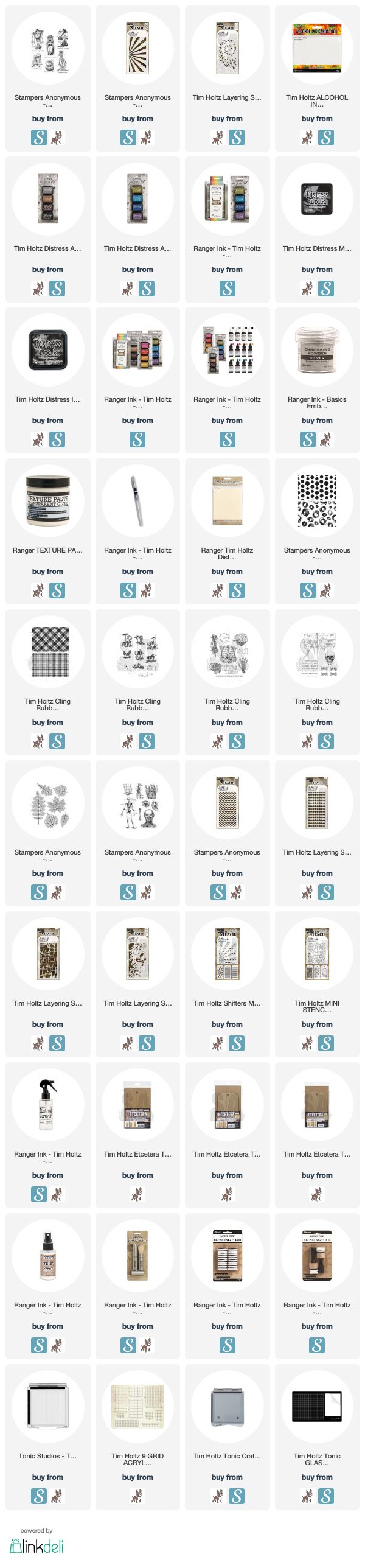
But I digress, back to the card. So this background is made the same way as the Toadstool card I posted a few days ago. I gave a pretty detailed tutorial on that post, so instead of repeating that, here is a link to the Distress Archival Resist Technique I learned from Tim Holtz. I made these at the same time and with the exact same inks as the plaids. So much fun! I hope you give it a try.
  1. The pumpkin, part of the Monster Reunion stamp set from Tim Holtz and Stampers Anonymous, was just stamped on Distress Mixed Media Heavystock with Black Archival Ink and watercolored with Distress Inks and Markers.  
  2. I cut him out with one of the small Stacked Deckle Dies from Tim Holtz and Sizzix, and then matted with a tiny bit of Black Metallic Kraftstock 
  3. I added a bigger mat to the pumpkin made from Heavystock that was colored with various orange Distress Stains and a light touch of Black Soot Distress Spray Stain. I cut it out of the center of the same mat I used for the big scribbly background paper.
  4. I finished it off with some messy zig zag machine stitching across the bottom just as a fun little element of interest. This type of stitching requires zero actual sewing skill, so it's perfect for those of us who don't really sew. If you have them, you could use one of the Stitches CMS365 stamps instead of machine stitching.
  5. Then I added a piece of chipboard or you could use some dimensional adhesive like foam dots to lift it off the background.
I added more messy stitching around the outside of the background and then cut a strip of the small dot paper, matted it with heavystock and Black Metallic Kraftstock and then tied a token around it.

Once you get the background technique perfected, this is really a simple card to replicate.
I'm always thankful you took the time to stop by and hope it was helpful.
Tami

I am an affiliate with Simon Says Stamp and Scrapbook.com so the links below send you to one of those stores depending on which logo you choose.  If you wish to purchase something from either store and use one of my links below, I get a small percentage of your order, at no additional cost to you. This helps me to defray the costs of this blog, the time, the ideas and tutorials I post here. Your help is greatly appreciated! Thank you!

Thursday, March 21, 2019

Distinguished Eclectic Adverts

Two of the new stamp sets released this month from Tim Holtz and Stampers Anonymous are the Distinguished CMS371 and Eclectic Adverts CMS372. These are both fabulous stamp sets with so many delightful vintage images. They make some wonderful masculine cards, which is what I was going for with these two cards.
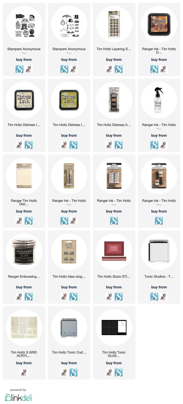
To make the background on this hatter card, I stamped the various hats from the Distinguished set onto a piece of Distress Mixed Media Heavystock with the Warm Archival Inks - Hickory Smoke, Vintage Photo and Ground Espresso. Then I did the whole Wrinkle-free Distress method with Antique Linen Distress ink. I believe I threw in a little Vintage Photo in their too. If you look closely, you will see that I randomly stamped the wording on the set all over the background, but in Distress Ink so that when it got wet it would run and lighten.
For the focal point, I stamped the Nicholai Michaelis Hatters stamp from the Eclectic Adverts, onto a piece of Distress Mixed Media Heavystock.  I stamped it with Black Soot Archival Ink and then did a weird technique that I'm not totally sold on, but I'll explain it anyway. LOL!

I stamped the hat image in Black Soot Archival and then immediately applied Ranger Superfine Black Embossing Powder. You may be saying to yourself, it doesn't look embossed to me! And that would make me happy, because I wasn't going for a traditional embossed look.  I heated it so it would melt into a shiny embossing. But then I remembered in one of Tim's tutorials years ago, or maybe a Creative Chemistry class (?) I don't know, but he said that we can't heat embossing powder too much or it will soak in to the paper and kind of disappear.  I wanted to see how it would look if I did that.  So I just kept heating the embossing powder until is soaked into the paper.  It's different. LOL! I told you I wasn't sold on this technique.  It does look a little old and worn and matte in some areas with tiny little bits of shine peeking through still.  So I think it basically accomplished what I wanted was a look that was more than just stamping with Black Soot Archival as there is a tiniest bit of texture, but it doesn't look shiny and new embossing. 
I finished the piece with alcohol inked Ideaology Hardware Heads, and a very neatly tied bow from a piece of dark brown twill I had in my stash. It is supposed to mimic a hatband.
This collar card was made to give to a friend.  The frame was made by lightly coloring a piece of Distress Mixed Media Heavystock with Crushed Olive Distress Ink. Then I added more ink on top of it through the THS097 Plaid Layering Stencil. I cut the center out with one of the Stitched Rectangles to make a frame.  On a second piece of Heavystock I applied Antique Linen Distress Ink using the Wrinkle-free Distress method. Then I stamped 5 of the collars from the Distinguished set and the Garden City Collar from the Eclectic Adverts in Black Soot Archival Ink. I watercolored them with Distress Ink, popped the frame on and added two buttons representing the buttons that would be used on collars.
Very simple, but I like it!

There are two examples of how I paired these two really great vintage, masculine stamp sets.  As always, I appreciate you stopping by!
Tami

I am an affiliate with Simon Says Stamp and Scrapbook.com so the links below send you to one of those stores depending on which logo you choose.  If you wish to purchase something from either store and use one of my links below, I get a small percentage of your order, at no additional cost to you. This helps me to defray the costs of this blog and the ideas and tutorials I post here, and your help is greatly appreciated! Thank you!