Showing posts with label Distress Inks. Show all posts

Thursday, February 11, 2021

Oh the Places You'll Go - Sizzix Chapter 1

Wacky Transport from Tim Holtz Sizzix Chapter 1 release is a fun die set. It reminded me a little of the Dr Seuss book 'Oh the Places You'll Go." So I decided to make a little project inspired by Dr Seuss.
I started with how I wanted to cover the outside of the Vignette Drawer with the Typewriter 3D Texture Fade. This process takes a little time but it isn't difficult.
Emboss several pieces of Distress White Heavystock by running it through the folder. Remember that you need to spray the paper with water and run it through only once for the extra heavy instead of the 3 times for other papers.
Cut the rows of letters just wide enough to fit on the sides of the Vignette Drawer. Then choose your Distress Ink Colors. I chose primary colors so that it had a very Seuss look to it. Salty Ocean, Candied Apple, Mustard Seed, and Mowed Lawn. I used a watercolor brush and alternated the colors, coloring in each of the letters
Once they were all colored in, I took the Black Soot Archival Ink pad, and lightly rubbed the pad over the raised letters to make them stand out.
Begin applying the pieces from the bottom of one side and continue in alphabetical order all the way around. Then start from the top down on the back. I adhered them with Collage Medium. Sand the edges and Ink with brown Distress Ink. I did not cover the top of the paper with Collage Medium to seal it, I just left it plain.
Here you can see a bit more of the inking.
I painted a Hardware Pull with Candied Apple Distress Paint and one it was mostly dry, I rubbed some paint off the edges to make it look old and worn.
To decorate each of the sections of the drawers, I tried to make the background fit the wacky transport that would be in it. I painted the inside of the entire drawer with Tumbled Glass Distress Paint.  I added some d=Distress Grit paste on the bottom of each section and painted it with Distress Paint in a color that would go the best with the feeling of each section.
Then I made some white clouds by adhered some of the circle punch outs from the Bubbling die that I used in the bottom section. Then I added some of the Funky Toadstools that I colored to look like trees. 
The middle box was going to be for the camper so I added some mountains from Alpine that were cut from Distress Cracked Leather Cardstock. I added more Funky Toadstools and the grass from that set along the bottom.
In the bottom box I adhered the Bubbling backdrop die which I had colored blue. then I added some Glossy Accents to make it shiny like water. I used more of the circle pop outs from the die as bubbles coming up from the bottom of the ocean. The coral is just several of the Funky Toadstools, but without the toadstool caps. The seaweed is one of the leaf dies from Funky Nature.
I wanted the vehicles to stand up so instead of cutting a bunch of them, I used the leftover paper to draw the shapes on some clear acrylic sheets. I don't remember where I got this, but I have a link to a few options below from Lawn Fawn and Judikins.
Once I had the shape drawn on the protective plastic cover, I cutout the shape and then adhered it to each vehicle.
I also used it as an opportunity to adhere the wheels as they are separate from the rest of the vehicles. Then it is easy to attach some sort of L shaped bracket to adhere to the back of the vehicle and the bottom of the section so the vehicles stand up.
I really like the bit of shine this gives to the windows for the Wacky Transport.
In order to get the sub to look like it is floating through the water, use the Bubbling as bubbles to do that.     
Here is a better photo of the top section of the drawer. I kind of wanted it to feel like a coastal park area. To add a little more interest I tied some twine around the top and a token that says Go See Explore to further the theme.
This middle section is a little bit like "glamping" if you color the camper a little like the one I have here.
From this perspective you can see how I used a line of the punch out circles from the background to make the bubbles that hold up the sub.I added a few more bits of Funky Nature "seaweed" and some of the Funky Toadstool caps as more coral.

This was a fun project to think up and then execute. I hope this inspires you to make one of your own with your own creative twists. 

I really feel like this could go in a child's room, a classroom or library. 

I'll sign off with the hope that we are all traveling again soon,
Tami

I am an affiliate with Simon Says Stamp and Scrapbook.com so the links below send you to one of those stores depending on which logo you choose.  If you wish to purchase something from either store and use one of my links below, I get a small percentage of your order, at no additional cost to you. This helps me to defray the costs of this blog, the time, the ideas and tutorials I post here. Your help is greatly appreciated! Thank you!



Monday, August 3, 2020

Cards for Kindness Post 7 - Scribbles

Today's Cards for Kindness that I'm focusing on are the two blue card backs in the bottom right corner.  It's not a color scheme I use often so I found this Iron-off Embossing Resist Technique to be a fun time to try some colors I don't usually use.
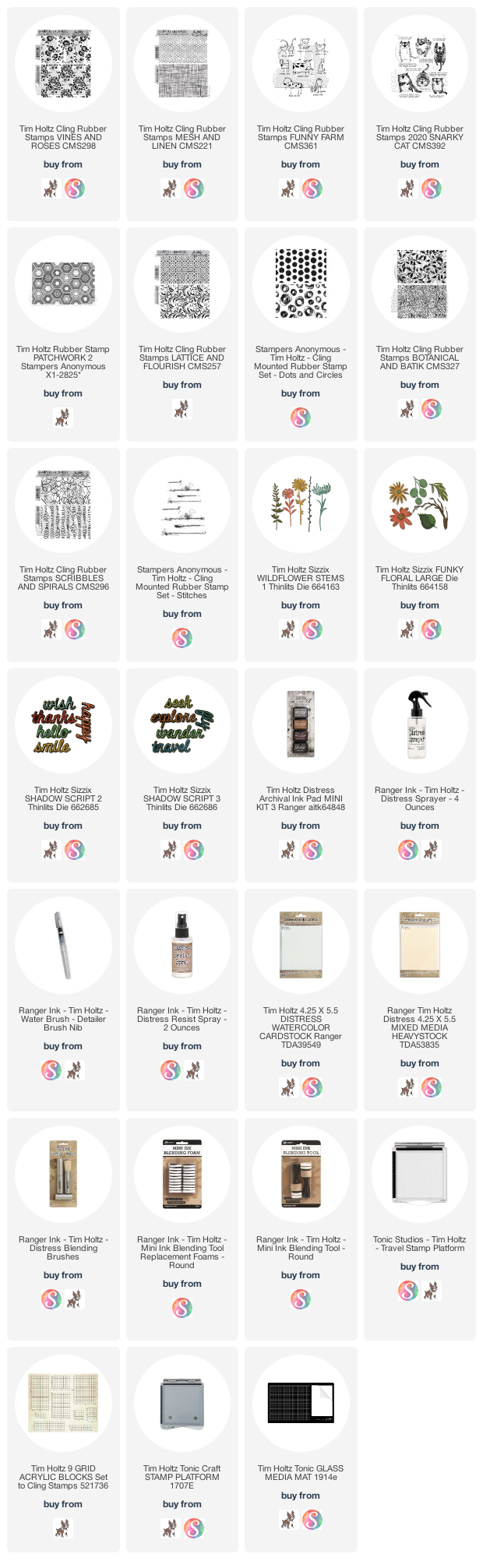
The stamp I picked for this background is Scribbles from Scribbles & Spirals CMS296 by Tim Holtz and Stampers Anonymous. Stamp the background onto the smooth side of a piece of Distress Watercolor Cardstock in Clear Distress Embossing Ink. Then cover with Clear Superfine Detail Embossing Powder and heat emboss. Then color the background with Distress Inks. I used Faded Jeans and Peacock Feathers Lastly, mist with water and set aside to dry.
When it is dry, lay a new piece of Distress Watercolor Cardstock smooth side down onto the inked side of the stamped piece. Thoroughly iron over them with a hot, dry iron until the embossing powder has had a chance to reheat and soak into the new piece of Watercolor Paper.
It should look like the one on the left above.
Ink it the same way you did the first one, mist and let it dry. Notice how the original maintained the detail and white resist, but the second one on the left has a softer, swirly water feel to it.
Both of these cards open from the side and so I cut the front flap short to For a coordinating piece of paper, I used the Linen stamp from Linen & Mesh CMS221 and inked it with the same Distress Inks, then sprayed it lightly with water and did a watercolor stamp onto another piece of Distress Watercolor Cardstock. I Studio Calico sequins that I've had in my stash for years.
For both of these cards I chose images and sentiments from the Snarky Cats CMS392 set. I know these are cards for kindness, but we all have such different personalities, preferences and things we think are humorous. Sometimes kindness looks like reaching out with a little snark and sarcasm to lighten the mood or make someone chuckle.

Let's go spread some kindness,
Tami

I am an affiliate with Simon Says Stamp and Scrapbook.com so the links below send you to one of those stores depending on which logo you choose.  If you wish to purchase something from either store and use one of my links below, I get a small percentage of your order, at no additional cost to you. This helps me to defray the costs of this blog, the time, the ideas and tutorials I post here. Your help is greatly appreciated! Thank you!

Monday, February 10, 2020

Snarky Cats Birthday Card

 Snarky Cats!!! LOVE this set of stamps from Tim Holtz and Stampers Anonymous! And how fun is it that they pair so perfectly with the Crazy Cats and Crazy Things Stamps? Today's post features a quick birthday card using them all.
Gather some Distress Inks, Distress Brushes, Sticky Grid, Distress Mixed Media Heavystock, and a stencil.
I hold the paper in place with Sizzix Sticky Grid, then align the stencil and tape it at the top so you can easily lift it to see your progress.
Stencil the various colors through the stencil. keeping if fairly light toward the center.
Here you can see what it looks like with the stencil in place.
Realign the stencil as best you can. Now you can see why you need to keep the center area light as there will be a little cross-over.
Stencil the other side. Taking care with the areas of overlap.
When you lift it up, you will wait until it looks like you want it to look.
Stamp your Snarky Cat and sentiment on the background. Stamp your Crazy Cat and Crazy Things pieces onto a second piece of Distress Mixed Media Heavystock. Gather some Distress Markers and a Waterbrush.
Watercolor the various accessories. Watercolor the cat on the background. The light inks of the background will lighten and blend in with the cat colors so if you kept the center light, you won't have to work so hard blending it in.
Cut them out and ink the edges.
Trim the cat's arms but NOT the paws. You want to make slits on the top and bottom of each arm to fit the milk bottles though.
This is what it looks from the back. You can see a corner of the bow tie, and the two bottles going through the arm slits.
Place the balloons in the top right corner and draw some string lines with a black marker.
Attach the hat, bow tie and thread the milk bottles under the arms before adding a tiny drop of adhesive.
I place the large milk bottle right under the cat's nose.
You can see the sentiment fits with the Crazy Things added.
Here is a close-up of the background.

That's it! Super fast, super fun!
Thanks for stopping by!
Tami

I am an affiliate with Simon Says Stamp and Scrapbook.com so the links below send you to one of those stores depending on which logo you choose.  If you wish to purchase something from either store and use one of my links below, I get a small percentage of your order, at no additional cost to you. This helps me to defray the costs of this blog, the time, the ideas and tutorials I post here. Your help is greatly appreciated! Thank you!

Wednesday, July 24, 2019

Santa's Helper - Part 2: The Presents

 Welcome back! I'm going to cover the second part of how to make this card today. Yesterday I covered the elf and today I'm talking about the presents.
 I used the presents on the inside and outside of the card. This is the inside of the card and the sentiment is from the Christmas Ribbon die set. The presents are fairly simple to assemble, but there many opportunities for making them different and unique, depending on the technique you use for the "wrapping."
  There are four dies in the Santa's Helper set and they fit on the Tim Holtz Sizzix Sidekick. I have the original brown one Tim released, but there is a new black Sidekick that is the exact same cutting machine, just a different color. I like that they fit in the Sidekick, because you can cut multiple presents just about anywhere. As Tim says, "Creative Convenience.'
 There are two ways to cut these presents. If you are using colored paper or patterned paper, you will want to cut two of the same present from two different colors. One for the "wrapping" and one for the "ribbons and bows." I represented the two in my samples with light and dark grey paper.
 In this you can see that I have drawn lines where the ribbons go on the presents. You will see some debossed areas on the presents that show you where they go. The presents on the bottom show where I have added the ribbons in the second color, as well as the four bows from the set.
 You can assemble them two ways. Here I attached the lid to the top of the present, and then added the ribbons. You will see that I didn't need to use the small ribbons that fit just on the lid. The long ribbons cover both.
 With this present, I attached the long ribbons to the box and smaller ribbons to the lid and then attached the lid. This gave it some dimension.  I could also have the lid tipped off this present with something coming out of it, or used just the wrapped lid as a present. You can see I have done that a couple of times on this card.
 Another present where I used the ribbons over the box and lid.
 This last present is small and has no lid.
 This is what mine looked like when they were all assembled.  I tried a little experiment on the last one by tilting the bow to see if it made the present look even more whimsical. I'm not sure I like it, but there you go. That's what experimenting is all about. LOL!
 I made my presents for this card with a different technique.  I gathered some of my background stamps that have tiny patterns for making "wrapping paper."
 Then I cut all four presents out of Distress Mixed Media Heavystock, just once.
 Then I took the present and colored it lightly with Distress Ink.
 Once I was happy with the base color on the wrapping paper, I moved on to making a pattern on the gift paper. I inked the CMS281 Stripes and Holiday with the same color as the base and then pressed the inked side of the present onto the inked portion of the background stamp.  I left the stamps on their storage cards and just laid them on my work surface facing up. I only needed to ink a small corner and that made clean up fast and easy.
 This is what it should look like when you are done.
 I left the ribbons in the die cut paper and colored them with the Distress Markers, right onto the paper. This Distress Mixed Media Heavystock is made to allow Distress products to work the way they were intended, to blend and react with water.
 Then I used my waterbrush to blend the color out to the edges before assembling.
 On this one I went bright with Mustard Seed.
 For this present I stamped both the box top and the box with CMS259 Tiles and Mosaic.
 Both of the stamps on this set have fabulous small, intricate patterns.
 I thought Mermaid Lagoon would be a great color ribbon to go with this package.
 For the third package I colored the top and package with Antique Linen.
Then I stamped the music from the CMS358 Music and Advert onto it in Pumice Stone.
 The fourth package I colored with Candied Apple.
Then made the package into polkadots using the CMS220 Dots and Floral stamp.
 Here are the finished packages with different types of bows.
 For the card, you can see that I used some box tops as skinny packages, and if I was stacking them I didn't add a bow until the top package.
These packages in Santa's sack are more examples of what you can do.

Once you get started cutting and inking, before you know it you have a nice pile of "wrapped" packages all ready for delivery.

My last post on this card will be coming soon. It will discuss the Cauldron die, and decorative snow sewing.

Thanks for stopping by for step 2!
Tami

I am an affiliate with Simon Says Stamp and Scrapbook.com so the links below send you to one of those stores depending on which logo you choose.  If you wish to purchase something from either store and use one of my links below, I get a small percentage of your order, at no additional cost to you. This helps me to defray the costs of this blog and the ideas and tutorials I post here, and your help is greatly appreciated! Thank you!