Today I'm going to feature the two cards I made using the
Hipster CMS288 stamp set. It is shipping now so you can get a set of these fun stamps right away.
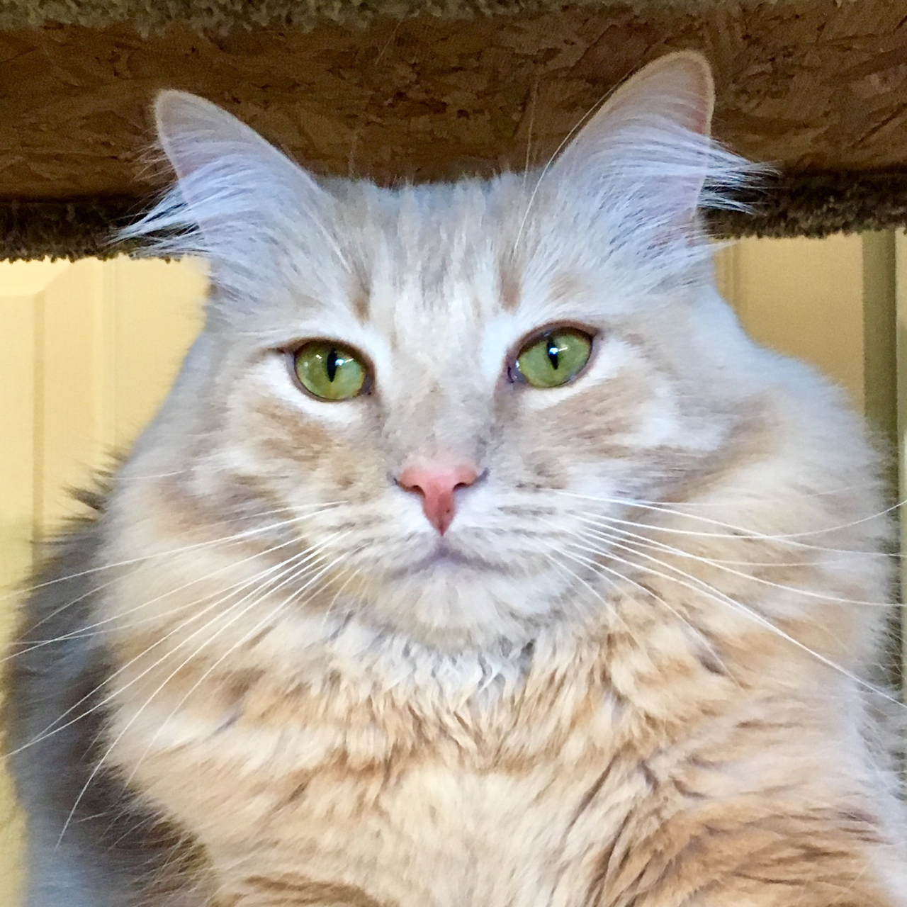
I chose to use the cat first because I have two male orange tabby cats who look at me like this pretty much everyday. One of them is trying his mind meld powers to get me to feed him all the time and the other is giving me his look of absolute disapproval that I decided to bring all these other kitties into HIS home. But they are both totally hip cats.
I couldn't do this post without showing them to you. Such handsome devils. This is James Otis (named after
my favorite American Revolutionary - look him up, he was revolutionary before revolutionary was cool!) who was called The Patriot by Samuel Adams, so I call him Patriot too. He was my first cat and is the one who owns the house and is annoyed by all the other cats. This is him demanding attention by laying on my work space in my studio.
This is X Atencio (named after my favorite Disney imagineer,
Xavier "X" Atencio. You should look him up too. You'll be surprised at what an important role he has played in your Disney memories!) He is the one who is always starving. Always. He is almost 15 pounds of Maine Coon mix cat and he just wants to eat.all.the.time. As I'm typing this he's meowing and rubbing against my legs wanting dinner.
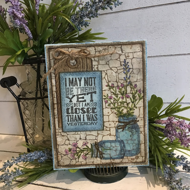
Ok, enough about two of the loves of my life and on to creating, right?!? I wanted the cat to look like he was standing in an alley, you know, like O'Malley the alley cat from Disney's Aristocats - another reason why I colored him orange.
The alley required some
Distress Grit Paste,
Palette Knife Set, and the
Slate Layering Stencil. While I was at it, I decided that I would make several backgrounds from the Slate and
Stone Layering Stencils so that I only had to do it once. I wanted to let it dry naturally so I didn't want to have to keep waiting on drying time if I messed up.
You use the palette knives to scraped the grit paste over the stencil and then lift up. I did some with part on the sides and also a few that were solid. Don't dry this with a heat tool or it will puff. I didn't want a puffy wall, I wanted a gritty wall. Isn't that some fabulous texture?
When it is dry you can do two things. You can seal it with
Distress Collage Medium, or you can leave it as is. I did both and will show you the difference between the two.
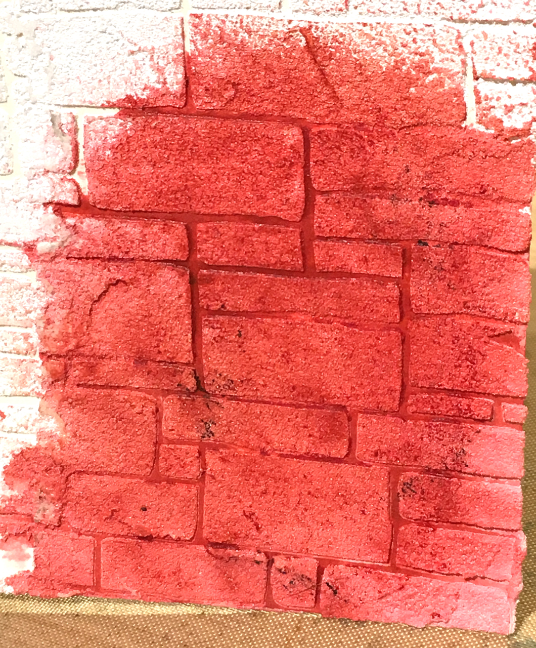
Collect some
Distress Crayons in colors you want to use to make brick, or stone, or slate. Remember that often these surfaces get dirty or moldy and so you should include brown, black and green in your choices.
For the background in the alley, I scribbled some Walnut Stain, Candied Apple, and Black Soot directly onto the grit paste.
Then I used my fingers to rub the crayons into the grit paste.
Then I spritzed my fingers with water and continued to rub the crayons into the grit paste.
Let it dry between layers and then keep adding layers of the color and wetting your fingers until you get the color and look you want. The beauty of the Distress Crayons is that if you hate it, just spritz it with water and most of the color with come off. Enough that you can start over and build up color again.
This is the brick wall I did with the Distress Collage Medium over the Grit Paste. See how the area in the center is very light and you can see the brush strokes because the Collage Medium seals the paper and grit paste. It does make the dry crayons move much easier over the surface and you need very little water to get the colors to mix.
This is the piece that was left from the card I made. It is unsealed and notice how there is no sheen to it, it is very matte, and the paper in the center is a grey/brown color because it wasn't sealed.
If you want the same stencil to look like Slate or the Stone background, you will probably want to go with more of a grey color scheme. I only did little bits of green and brown in spots and Pumice Stone, Hickory Smoke and Frayed Burlap for the bulk of the stone color.
Same thing, I rubbed it in with my finger tips. Just a note here, I would refrain from doing this too many times in one sitting. Grit paste is truly gritty and you will rub your fingertips raw, or at least very, very sore. LOL!
With the stone backgrounds, you don't need to spritz very much water on your fingers when you are blending the crayons.
You will have some white spots showing through and you might like that but I wanted my stone/slate walls to be darker, so I scribbled some Black Soot Crayon on my Craft Sheet and used a Water Brush to brush in in the crevices to cover the white spots and then blended it in with my finger.
See, much better! You just need to play with the colors until you get the look you want. This is what the crayons look like on unsealed grit paste.
This is what the crayons look like on grit paste that has been sealed with Distress Collage Medium. It's definitely a different look. I like both for different purposes. You may recognize this from my Tell Your Story fish over the mantle card. I'll be posting that card later and will link it back here.
This is another example from yesterday's post of the Stone stencil with grit paste that had been sealed. Notice again the brush strokes in the center area where the sky is showing through, and how the light colors show through between the stones on both this sample and the one above.
Hipster Card #2 is a completely different look. I loved this hip ostrich. I thought she looked like she would be a sweet, sassy grandma.
The background was very simple. I inked the Roses stamp from the
Vines and Roses CMS298 set with Shaded Lilac Distress Ink, lightly spritzed it with water and then stamped it onto
Distressed Mixed Media Heavystock, then I lightly blended the background with the same color ink, and edged it even darker with the same color.
I stamped her in
Ground Espresso Archival Ink, then watercolored the image with
Distress Markers. I added two flowers from the Flower Jars set and detail cut them out before I added them to her hat and shoulder.
I could see this as a really fun Red Hat Society card or invitation but I didn't think of that until after I had made the card. To make the background, I covered the image with
Distress Microglaze and then lightly colored the whole background with the large watercolor brush in Picked Raspberry.
There you have it. Two totally different Hipster cards. Such a fun set, I'm looking forward to playing with it a little more soon!